Friday, 10 May 2013

Magazine Comparison


Colour- In Vogue there are only three main colours. This house-style is used for many magazines. Here they have used white, black and blue. On the Top Gear magazine cover they have used more of a variety of colours but the house-style is still quite plain and easy to see what is going on. They have used basic colours, White (being the main colour of the text), red and yellow. 
Design- he text Vogue have used is very pain and simple. They haven't used any different fonts, it is all easy to read, stands out and is clear to see what is being said. On the front page of Top Gear the Design is quite similar, it is the title which is obviously the peice of writing which stands out most. There is a peice of text in the bottom right hand corner, which is written in different sizes to make the mains words stand out the most, but other than this there is no other writing, the main feature is the car. Just the same as in Vogue the main feature is Beyonce.

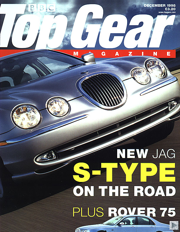
Image- Vogue have obviously used Beyonce as their main focus on the front of the magazine because she is a huge popstar and is someone who is always in the limelight who many girls aspire to be like. The Top Gear front cover have also only one picture, and in this case is the picture of the Jaguar. This car has been put on the front cover because it was a new car out that month when that issue of the magazine was published. And it's also a car which many working class men would love to have.

Pose, style, hair, make-up-
On the front cover of Vogue they have styled Beyonce in a very sophisticated way. What she is dressed in, the way she has her hair and the way her make-up has been done is all very professional and she looks very working class. This would encourage people of her age to want to buy the magazine because people want to be just like her. On the Top Gear front cover they have no people so there is no style/make-up/hair to be styled. But the style of the car is very sophisticated.

Composition and framing-

The composition of the Top Gear front cover and of Vogue are both quite similar, when yourst look at both of the pages you instantly look in the top right have corner of the page. This is the side where the Title and most of the pages writing has been placed. The background of the Vogue cover is not very clear, but it looks as though beyonce is standing up against a wall and you can vaguely see out of the window next to her. On the cover of Top Gear all you can see is that the car is driving down a road. This isnt very clear though, as the picture of the car is very big and is the main focus of the cover.


Written codes- how are words used on the cover?

On the cover of Top Gear you can see that the picture they have used suggests that inside it will be about cars and that on the front of Vogue by looking at both the picture and the text it will be about fashion and womens topics
e.g. losing weight and fashion for every firgure from 0 to 20.

Language-

The language that has been used on the front of Vogue are words which catch the readers attention and make the reader wan to buy the magazine. In this case, the words in bright blue stand out the most. They purposely pick out the main words and write short, sharp statements which are straight to the point. On the front of Top Gear there is alot less language but they have used very few words but the words they have used have been chosen carefully to get across what is it that they are promoting, the reason why and that it is a new car.

Overall impression- how effective is the front cover?

In my opinion, both front covers are very good. They both put across the point they are trying to give and are both very affective. You can clearly see straight away what it is that they are going to have in their magazine and know what youare expecting to be inside the magazine. The Beyonce one gives you a bit more of an idea as it give you short statements and sentences about a few articles that will be in the magazine. Whereas the Top Gear one doesnt tell you about any of the articles which will be inside it, although it is similar to most editions so you know to expect that inside there will be more articles about cars.
Before i started my school magazine on the computer i designed a flat plan on paper. I thought this would be better, to do a draft first before the real thing so i knew kind of where to start. Above were all of my ideas that i put together and originally planned on woking around. As you can see though my flat plan is completely different to what my final product looked like. When you're designing it on the computer you com to realise what skills you have and realise it isnt so easy as how you drew it out, therefore things changed, and it ended out look completely different.

Questionnaire for School Mag

Questionnaire- Year 7’s
Tick/Cirlce the one which applies to you
1.       If the school offered a magazine for you to buy, what is the most you would be willing to pay for it?
£1
£2
£3
£4
£5+

2.       How often would you buy it?
Weekly
Monthly
Seasonally
Yearly

3.       Would you like to see a horoscope section in the magazine?
Yes
No

4.       Would you like it to have games and puzzles for you to do?
Yes
No

5.       Have you ever been involved in any form of bullying in the school?
Yes
No
(If not then ignore question 6 and go to question 7)

6.       If  so, did the school help with the issue?
Yes
No

7.       Which subjects do you enjoy most as school? State 3
-
-
-

8.       Do you take part in any school clubs? If so, state which one/s


9.       What  subjects do you enjoy most in school? State three
-
-
-

10.   What do you enjoy doing most out of school? State 3 activities
-
-
-

Practise Photos


Here are some of the pictures from a photo shoot that I did during my research and planning stages for my school magazine. I made sure I got a variety of different shots so they weren't all the same, I think with some slight changes they could have been very effective.
For the first picture on the left hand side I think this gives a positive vibe, it is something that is good to see on a school magazine as it shows children working together. One thing that isn't so good is that it is slightly too close up that it crops the boys head off, which isn't something professional photographers would do.
The second picture along is another one which shows children with teachers enjoying their day at school. It is at a good angle, a full length, long shot. What ruins this picture is the lighting. The sun is shinning on the bottom half of the picture, therefore makes it not as clear, and looses focus.
The third picture is a good picture. It's an action shot, very natural of three students happy at school, which is another good thing to include on a music magazine.
The fourth picture is also a long shot. It's good to include both boys and girls so the magazine doesn't look so one sided. Although in this picture the girl is looking away which ruins the photo.
Doing this practise shoot i realised that it is important that it is important because when it comes to taking the final pictures for the magazine i have an idea of what types of things i need to look out for and what things need to be focused on and also what looks good and what doesnt. Having a variety of shots is also important as it shows the examiner you are capable of more than one thing and have a range of skills.

Questionnaire

To help with my research on what types of music people liked and a little bit about how often they listen to it and the people that they liked, i created my own questionnaire. I didnt hand this one round to people i knew as i had previously done this before. I created it on a website called surveymonkey.com.

Here is the link to my questionnaire, feel free to fill it out for yourself!
http://www.surveymonkey.com/s/77LNXNZ

Just incase you dont want to click on the link, the questions that i asked were..

1. What gender are you?
2. What music magazines do you read?
3. How often do you read magazines?
4. How often do you go to concerts?
5. What genre of music do you like?
6. Do you download music for free or pay for it?
7. How much would you be willing to pay for your music magazines?
8. Who is your favourite recent solo artist?

They were all closed ended questions so i didnt have such broad feedback and i could get specific answers. Below are some of the results which i recieved.


I havent presented all of my results here is just a few exams of what they look like when put into a grid. The top one about gender, you can see that out of seven people of answered the survey 5 were girls and 2 were boys. This could suggest that the feedback could be quite one sided as girls have different views to boys. I also have a lot more girl friends than boys so this is likely to be why. Another reason could be due to the fact that girls are more likely to sit down and fill out a survey where as boys have a different attitude and the majority of them cant be bothered.

Looking at the second question, out of the seven people who answered the questionnaire, 3 of them never read magazines, this isnt very helpful, my aim was to find as many people as possible all with different interests so i could get a more stratified sample. Although the other four which answered read magazines every week and every month which does give me more useful information.

The third question i have screen shotted refers to how often people go to concerts. 4 out of the 7 said they go every few months. This is a good amount as this asumes they must be interested in music to want to go and see someone in concert.

Collecting information helps you like this alot so you know what types of things to include in your magazine.

Front Cover


Here is my school magazine cover. I have stuck to the typical conventions of a magazine of sticking to just two or three colours so there isnt too much going on and featured a few of the best cover lines on the front, this is the best way to attract an audience. The picture is another important aspect of aa front cover, as this is likely to be the first thing a reader notices when looking at your magazine. Obviously them wearing uniform is essential when designing a school magazine as you know who the target audience is. Making sure they are smiley is another key thing as you want it to be as warming and as friendly as possible. One thing i have picked up on since designing the magazine is that i should have had a girl featured aswell. Having two boys makes it seem slightly swayed towards just the male gender, and this was not my purpose. I have applied the typical features which you would expect to see, even the little details such as a barcode, issue number and a price.

Thursday, 9 May 2013

Existing Music Magazines


Researching into NME helped me to see what kind of things they presented for the reader. What articles they contained, what promotions they offered and what housestyles they kept to. Looking at all the different aspects of a magazine gives you a much broader mind for when you come to designing your own as you know roughly what types of things you need to include.